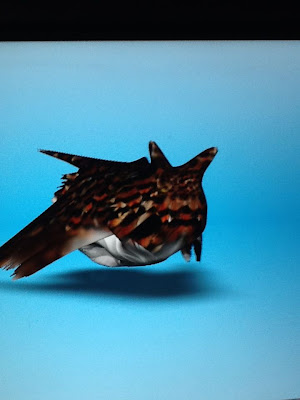
I must give my stencil project the award for my best piece so far this semester, it is beyond what I expected it to turn out like. The colors flow really well together, my cuts were neat, precise, and detailed which gives it texture. Yeah I took longer than everybody else to finish, but I guess I saved the best for last. The colors give it a very natural look. If I had used pink, or purple...or any color like that, I do not believe it would hold the same effect. I love this piece a lot!
My second best piece was my value scale drawing. Bono is one of my favorite musicians, it was an experience to draw him. I am not afraid of the dark, which is why this piece came out so great! In order to get a portrait like this to turn out, you must include contrast and that is exactly what I did. I hate bragging on my work, but this is a really great piece. The shading flows very well. I spent a lot of time on this piece and I know it was worth every second.
Tuesday, March 26, 2013
Printing Project
This project was very successful I believe. I learned a new skill, printing. The process was sort of frustrating and tedious but the end product was very worth while. I think everything worked about this project. It is not exactly what I had invisioned but it turned out great. The most dificult part about this project was getting my print carved out. It was difficult to picture what levels should have been cut out and what shouldn't have. In the end it came out well, so I am proud of my work.
Thursday, March 14, 2013
Magazine Cover
I enjoyed this project, it allowed me to reach into the graphic design world in a communications sense. The most difficult part was thinking of a name to put as my magazine title. The rest was easy as pie! I am very creative when it comes to things like this. I got lucky to find a funny face picture of Leonardo DeCaprio, which topped everything off! The fonts go really well together, which gives the cover uniformity. It ties everything together in the end.
Tuesday, March 12, 2013
Self Portrait - Stencil
The stencil project was really fun, I have not completed my piece yet but I think it'll turn out pretty well. The hardest part is thinking about how the colors will line up. I ran into that problem already but I'll get it to work. This project was a battle, I literally cut myself maybe 3 times while cutting out the stencils. I cut myself pretty bad the first time and had to stop for the day so I didn't bleed all over my paper. I hope this turns out in the end.
Self Portrait - Pencil
During this project I learned the scales and tricks for drawing self portraits. They are very useful because it allows the features of the face to be proportional. I like how the nose turned out and the shading under the eyes. The eyes were kind of difficult and I messed up the value on one, so one eye is darker than the other. I still have to finish my hair, and ears and make touch ups but overall I think it'll turn out pretty well.
Monday, March 11, 2013
Thursday, March 7, 2013
Bush and Butthead
This project was difficult because it was hard to come up with good idea. I finally came up with George Bush and Butthead from the MTV cartoon. The actual editing of the photo wasnt difficult in any way.
iPad - Apple
The first day of using iPads, Mr. Sands told us to paint/draw an apple. The apple I drew wasn't that great. The colors are nice but the overall shape is a little off. However, I incorporated a table and a shadow to give a little life to the piece. I think we could possibly use 123D Sculpt if we did some clay animation project. We could use it to design our objects before we use the clay.
Subscribe to:
Posts (Atom)


